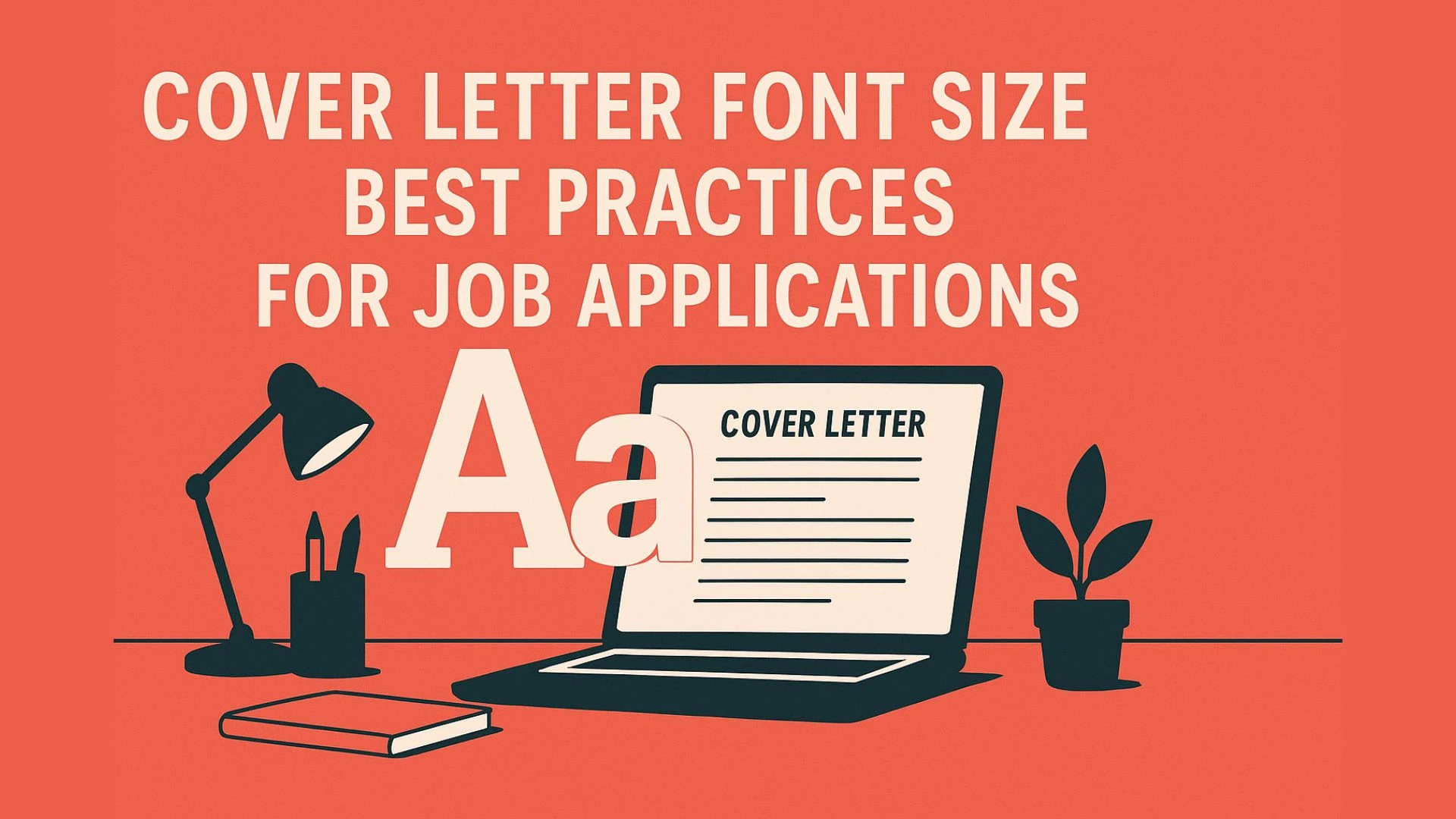
Cover Letter Font Size: Best Practices for Job Applications

TL;DR
The best font size for a cover letter is 11 or 12 points in a professional font such as Arial, Calibri, or Times New Roman. Anything below 10.5 is too small and strains readability, while sizes above 12 can look unprofessional or like filler text. Stick to 1-inch margins, keep formatting consistent, and use a clean, easy-to-read style that aligns with your resume.
Why Font Size Matters in a Cover Letter
Choosing the right font size might seem like a small detail, but it plays a big role in how your cover letter is received. A well-formatted letter shows professionalism, makes life easier for recruiters, and ensures your application passes through Applicant Tracking Systems (ATS) without issues.
1. First Impression: Readability Signals Professionalism
Recruiters form an impression of your application in just seconds. A cover letter that’s easy to read communicates attention to detail and professionalism. Too small, and it looks cramped and careless. Too large, and it can feel like you’re trying to fill space.
2. Recruiter-Friendly Formatting
On average, recruiters spend less than 30 seconds scanning a cover letter. If your text is hard to read, they’ll likely skip over key points — or your entire letter. Font size 11–12 in a professional font ensures your content is digestible at a glance.
3. ATS (Applicant Tracking Systems) Readability
Many companies use ATS software to process job applications. If your cover letter uses inconsistent formatting or fonts that are too small, the system may not parse it correctly. Standard fonts at a readable size improve your chances of making it past the digital gatekeepers.
“The right font size makes your cover letter easy to read and hard to ignore.”
👉 Pro Tip: Always preview your cover letter in PDF format before sending. What looks fine on your screen could appear smaller when printed or opened on another device.
Related
Recommended Font Sizes for Cover Letters
Font size is one of the simplest yet most important formatting decisions you’ll make. The wrong size can make your cover letter hard to read or look unprofessional. Here’s a breakdown of what works, what doesn’t, and why.

Standard Options (11 vs 12)
Both 11 and 12-point fonts are widely accepted for cover letters.
12-point font: The traditional choice. It offers excellent readability and a classic, professional appearance.
11-point font: Slightly more compact, which helps if you want to fit more information while keeping the layout clean.
👉 Either option works — just make sure you stay consistent with your resume.
Minimum Readable Size (10.5)
Some applicants use 10.5-point font to squeeze in extra details. While technically still readable, it can appear cramped, especially if margins or line spacing are tight. Use it only if absolutely necessary and ensure the letter is still easy to scan.
Sizes to Avoid (10 or Below)
Anything 10 points or smaller is too difficult to read. Recruiters may not bother straining their eyes, which means your application could be ignored. Tiny text also makes your letter look unprofessional and rushed.
Sizes to Avoid (13 or Above)
Fonts 13 points or larger make a cover letter appear like you’re trying to fill space with fewer words. Oversized text distracts from your message and reduces credibility. Unless you’re formatting for accessibility needs, avoid going this big.
Best Fonts to Use in a Cover Letter
The font you choose is just as important as the size. A clean, professional font makes your cover letter easier to read and ensures it passes through Applicant Tracking Systems (ATS) without formatting issues.

Safe Choices (Recruiter-Approved)
These fonts are widely accepted in professional documents and are considered safe bets for both resumes and cover letters:
Calibri – Modern, clean, and highly readable. A common default in Microsoft Word.
Arial – Simple and professional with excellent screen readability.
Times New Roman – Traditional, formal, and familiar to recruiters.
Helvetica – Crisp, neutral, and widely used in business communications.
Georgia – Slightly more modern than Times New Roman, with strong readability in print and digital formats.
👉 These fonts balance readability, professionalism, and ATS compatibility.
Fonts to Avoid
Some fonts may look creative, but they can hurt your chances of making a strong impression:
Comic Sans – Casual and unprofessional in formal job applications.
Papyrus – Overly stylized and difficult to read.
Script or decorative fonts – Distract from your message and may not scan correctly in ATS systems.
👉 Rule of thumb: If it looks like a greeting card font, don’t use it for job applications.
Why Professional Fonts Matter
Readability: Recruiters spend seconds scanning your cover letter; hard-to-read fonts get ignored.
Professionalism: Clean fonts convey competence and attention to detail.
ATS-Friendly: Non-standard fonts risk rejection or formatting errors in Applicant Tracking Systems.
“A professional font doesn’t get noticed — and that’s the point. The focus should stay on your words.”
Formatting Tips for Cover Letter Fonts
Choosing the right font and size is only half the battle — how you format your cover letter is just as important. Proper formatting ensures your document looks polished, professional, and recruiter-friendly. Here are the key rules to follow:
1. Stick to One Font Throughout
Consistency is critical. Using multiple fonts makes your cover letter look messy and unprofessional. Select a single professional font (like Calibri, Arial, or Times New Roman) and use it for every section — header, body, and closing.
2. Use Bold for Emphasis Sparingly
A little bold text goes a long way. Use it only to highlight job titles, company names, or section headers. Overusing bold or italicized text distracts from your content and makes the letter harder to scan.
3. Line Spacing: 1.0–1.15 for Readability
Tight spacing makes text look cluttered, while double spacing wastes valuable space. The sweet spot is single spacing (1.0) to 1.15, which ensures your cover letter is comfortable to read while staying concise.
4. Margins: 1 Inch Standard
Always use one-inch margins on all sides. This creates balanced white space and keeps your cover letter easy to print or convert into PDF format without formatting errors.
5. Alignment: Left-Aligned, Not Justified
Keep your text left-aligned. Fully justified text can create awkward spacing between words, especially in digital formats. Left alignment ensures a clean, professional appearance and makes scanning smoother for recruiters.
“Clean, simple formatting beats creative fonts every time.”
👉 Pro Tip: Before submitting, preview your cover letter as a PDF. This ensures your formatting stays consistent across devices, whether a recruiter opens it on a desktop, tablet, or phone.
Common Mistakes to Avoid with Cover Letter Font Size
Even a strong cover letter can lose impact if the formatting looks sloppy or unprofessional. Font size mistakes are surprisingly common — and they can make your application harder to read, less credible, or even overlooked. Here are the pitfalls to avoid:
1. Shrinking Font to Fit More Content
Many applicants try to cram too much information into one page by reducing the font size. This makes your cover letter look crowded and forces recruiters to strain their eyes. Instead, edit your text for clarity — keep sentences concise and cut unnecessary filler.
2. Mixing Fonts or Inconsistent Sizes
Switching fonts or sizes mid-letter looks careless. Consistency is key: stick to one professional font and use the same size throughout the document. If you want to add emphasis, use bold or italics sparingly instead of changing fonts.
3. Using Size 9 or Smaller
Anything below 10.5 is too difficult to read on most screens and when printed. Recruiters scan applications quickly, and tiny text can cause them to skip your letter entirely. Small fonts also make your cover letter look cramped and unprofessional.
4. Expanding Font Size to “Fill a Page”
On the other end of the spectrum, enlarging your font to 13 points or more makes it look like you’re trying to hide a lack of content. Recruiters can spot this instantly. Instead, focus on quality over quantity — one well-written page is all you need.
5. Ignoring Line Spacing and Margins
Even if your font size is correct, poor spacing and margins can ruin readability. Avoid cramming text with tight line spacing or stretching content with wide margins. Stick to 1.0–1.15 line spacing and 1-inch margins.
“It’s not just what you say in a cover letter — it’s how easy it is to read.”
Related
FAQs
Is font size 11 or 12 better?
Both are acceptable. Font size 12 is the traditional standard and slightly easier to read, while 11 looks modern and helps fit more content on a page. Either works, as long as you stay consistent throughout the cover letter and match it with your resume.
Can my cover letter be 11 point font?
Yes. 11-point font in a professional typeface like Calibri, Arial, or Times New Roman is widely accepted. It’s recruiter-friendly, easy to read, and helps keep your letter concise. Just avoid shrinking the text below 10.5, which can compromise readability.
Should a cover letter be A4 or letter size?
It depends on location. In the U.S., the standard is letter size (8.5 x 11 inches). In Europe and most international markets, use A4 (210 x 297 mm). Always match the format to your region’s norms unless an employer specifies otherwise.
Is font size 9 too small for a cover letter?
Yes. Size 9 is too small and difficult to read on both screens and paper. Recruiters skim quickly, and tiny text can discourage them from reading your letter at all. Stick with 11–12 for the best balance of readability and professionalism.
Is font size 9 okay for CV?
No. Just like cover letters, CVs should be highly readable. Anything below 10.5 looks cramped and unprofessional. Recruiters may skip over content that strains their eyes. Stick to 11–12 for a clean, easy-to-read presentation.
Is 10 too small for a cover letter?
Yes. While 10-point font is technically readable, it often looks too dense and hard to scan. Recruiters don’t have time to zoom in on text-heavy applications. Aim for at least 10.5, but ideally 11 or 12, to ensure professionalism.
Is resume font 11 or 12?
Both 11 and 12 are considered standard resume fonts. 12 offers a classic, traditional look, while 11 provides a slightly more modern and compact style. The key is to stay consistent with your cover letter so both documents look polished together.
Is 10.5 too small for a cover letter?
10.5-point font is technically acceptable but not ideal. It can appear cramped, especially with tight margins or heavy text. If you must use it to fit content, make sure line spacing is clear and margins are balanced for readability.
Is 10 font too small?
Yes. 10-point font is too small for both cover letters and resumes. It creates eye strain, looks unprofessional, and may cause recruiters to skim past your application. For best results, stick with 11–12, which are universally accepted.
Conclusion
The font size you choose for your cover letter can make or break its readability. Stick with 11 or 12 points in a clean, professional font like Calibri, Arial, or Times New Roman. Anything smaller looks cramped, and anything larger feels like filler.
Remember: hiring managers skim quickly, and ATS systems process formatting. A cover letter that’s easy to read shows professionalism, attention to detail, and respect for the recruiter’s time. Pair it with consistent margins, spacing, and formatting for the best impression.
👉 Bottom line: Keep it simple, keep it readable, and let your words — not your font size — do the talking.